



Here on the Research & Analysis team, we often field questions from both Association members and others across the advocacy space, which warrant answers. Rail Passengers’ own Joe Aiello recently handed us one such question, inspired by a recurring argument in rail enthusiast discourse:
“We know ridership and revenues are breaking records each year, but so many online naysayers say Amtrak is artificially limiting supply of seats by keeping rolling stock out of service, so those records don’t mean much. The Horizons (which Amtrak has been relatively quiet about timelines on returning to service) are part of it. It’s also cars sitting in Beech Grove, the Superliners being used on the Illinois routes, the “insert route here” running with only 1 or 2 coaches. I’ve heard it all. The question is: can we find out how many passenger seats were available 10 or 20 years ago compared to this year? At least on average?”
We absolutely can compare seat availability over the last decade. But when we do, it turns out there’s way more to the story than what the online naysayers suggest. If there is room to criticize Amtrak, it’s not that they’re under-utilising their rolling stock, but that they’ve taken so long to acquire enough rolling stock to meet passenger demand. Let’s look at the data.
The Load Factor Story
The clearest evidence that Amtrak is not withholding capacity, is found in the divergence in load factor between Northeast Corridor, state-supported, and Long-Distance routes over the last decade. Load factor, or passenger-miles divided by seat-miles, represents what percentage of the seats on a vehicle, route, or network are full. The below chart shows how load factor varies across the Amtrak system.
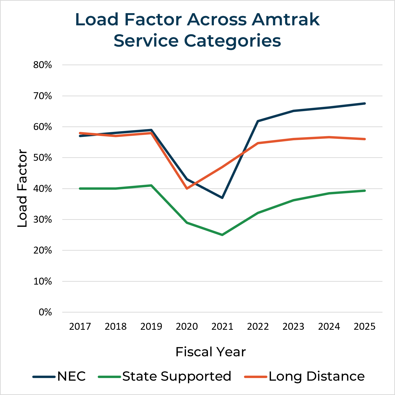
Before COVID, the long-distance network and NEC had broadly similar average load factors around 55-60%, while those on state-supported routes were significantly lower at around 40%. Since COVID, the state-supported and long-distance routes have experienced similar ridership recovery, gradually returning to their pre-COVID levels by 2024-2025. For a time during the height of the pandemic in FY2021, the NEC ran at a lower load factor than the National Network or even the average pre-COVID state-supported route. But the NEC’s load factors sharply rebounded in 2022 and have continued to rise ever since. Now, could that be because Amtrak has artificially reduced the number of seats on the NEC? No, because the data shows the opposite: from FY2016 to FY2025, the number of seat-miles Amtrak ran on the NEC increased from ~3.5 billion to ~4.0 billion. The only logical interpretation is that demand on the NEC is surging, which lines up with what those of us who regularly ride it can attest: for every early-morning or late-night train with nearly half the seats vacant, there will be a peak-time or mid-day train with standing room only.
But load factors also vary widely within service lines. On the National Network in FY 2025, the Sunset Limited had an average load factor of 41% while the Coast Starlight ran at 65%. Among state-supported corridors, the Borealis was at 72% while the Ethan Allen (on the portion of the route North of Albany at least) had only 21%. To answer questions about equipment utilization, it therefore makes the most sense to examine individual routes using specific equipment types that have at times been unavailable for Amtrak’s use. Let’s consider the Horizon cars, which have been out of service since March of last year due to corrosion, and are only just now being reintroduced.
The Horizon Story
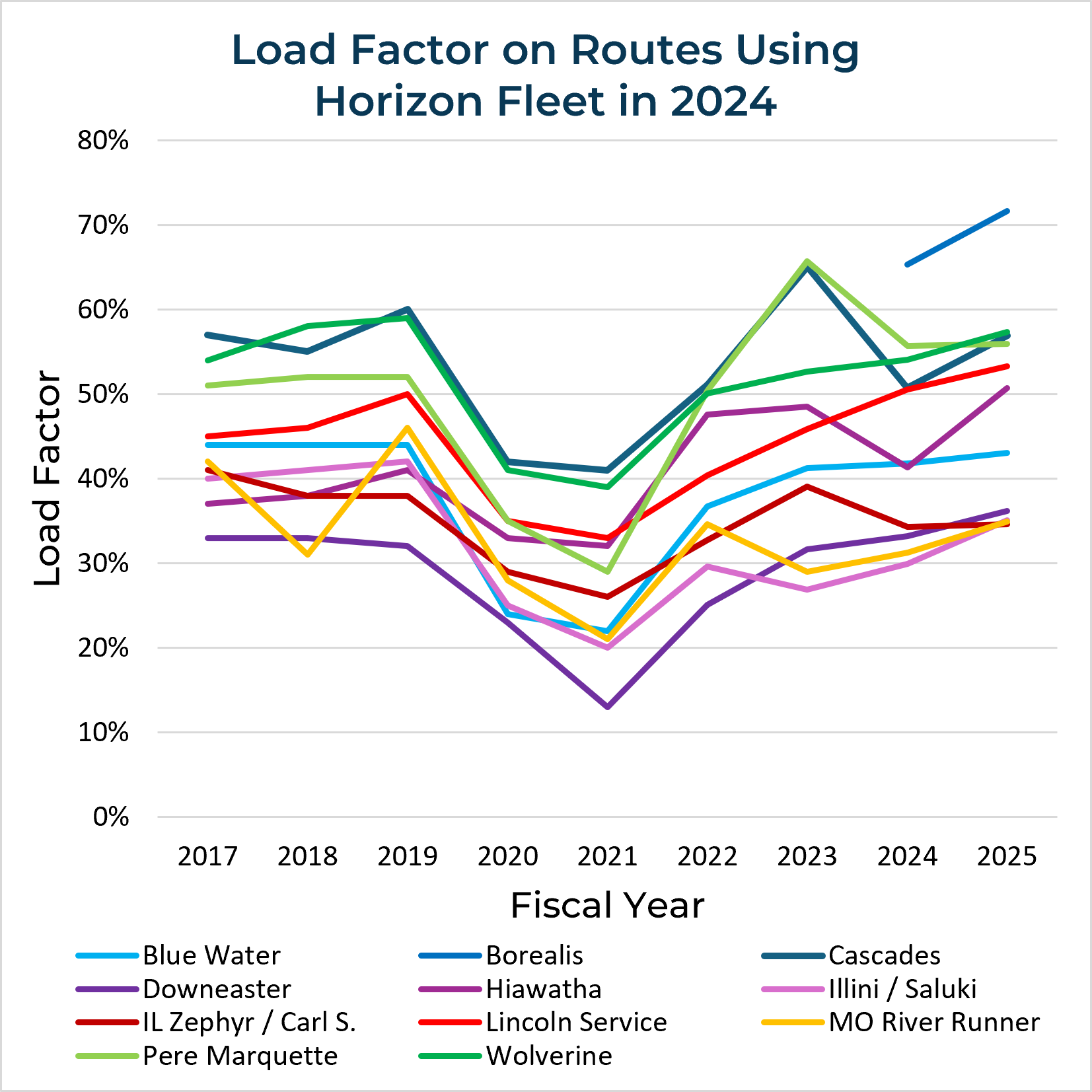
In the decade prior to the Horizon cars’ withdrawal, the Amtrak routes which use them saw broadly similar patterns of COVID-driven ridership decline followed by recovery to previous norms. A few routes experienced post-COVID load factor spikes, like the Downeaster and Pere Marquette in 2023, but similar one-year variations have occurred on individual routes pre-COVID, as on the Missouri River Runner in 2018-2019. The most notable individual data point is on the Borealis, which began service in 2024 with the highest load factor of any state-supported route and has only gotten busier since then.
Because the Horizons were withdrawn just over halfway through FY2025, we won’t have an annualized comparison of load factors before and after their withdrawal until the full FY2026 data are published in a few months. But these annualized data still provide a route-by-route baseline to contextualize Amtrak’s monthly performance data, which are available at the time of the withdrawal in March-April 2025 and precisely one year later in March-April 2026. As shown in the table below, seat miles and ridership both declined sharply on every route in the month following the Horizons’ withdrawal, and even with replacement equipment they still had not fully recovered on many routes one year later.
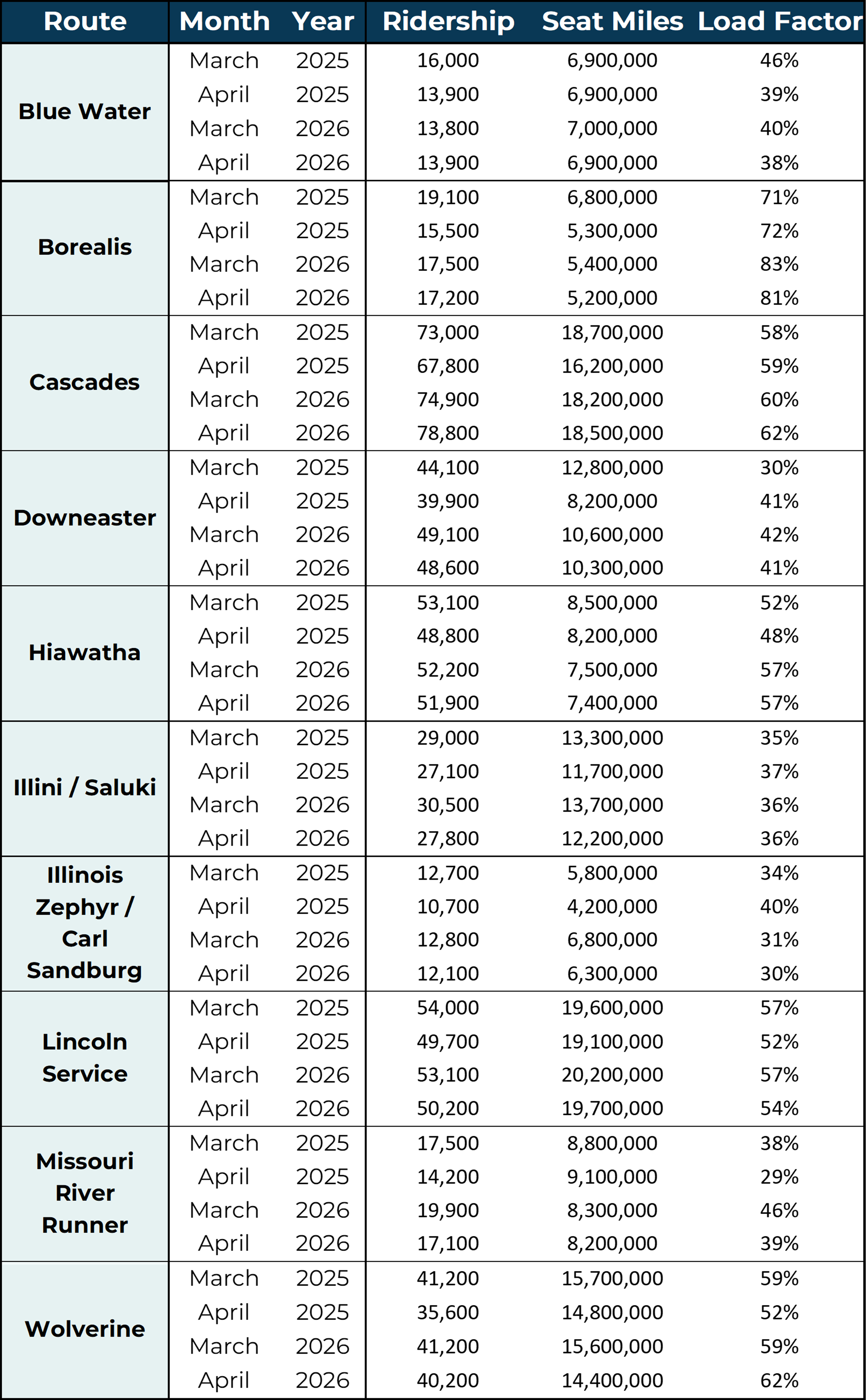
The loss of available seats due to removal of the Horizon cars in March 2025 underscores how much pressure is on Amtrak’s fleet capacity. The impact of losing the Horizon cars has been mostly mitigated by transferring Superliner coaches from the National Network to trains like the Borealis and the Illinois Routes, and Amfleet Is from the Northeast to the Downeaster and Cascades. But the Superliner fleet had itself been partially out-of-service through 2024, and the Amfleets’ availability is constrained due to their sheer age. At the same time, train cancelations on the Northeast Corridor due to construction projects have driven load factors higher when seat miles temporarily declined, even as year-round seat miles have increased. These higher load factors may give the impression that Amtrak is operating more efficiently, but is that actually the case?
The Borealis Story
Let’s examine the route with the highest load factor across Amtrak’s system, to see what it can tell us about running trains efficiently. The data for the Borealis in Amtrak’s archive of monthly performance reports is tabulated below.
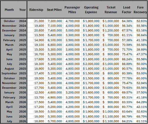
But we have to be careful when interpreting data which measures different quantities (e.g. dollars vs. percentages) and magnitudes (e.g. thousands of riders versus millions of passenger miles). So let’s normalize the data: we divide each data point by the average over the period the data covers. A value of 1 thus represents the average for that variable, higher values are above-average, and lower values are below-average. If you’re familiar with Sabermetrics in baseball, this is like converting a stat like OPS to OPS+: we’re translating how well a player (or train) performs in absolute terms, to how well that player (train) performs relative to the whole league (service period). While we’re at it, let’s also graph the data to more easily visualize any trends, and add some correlation coefficients to gauge the significance of those trends.


The left graph shows two relationships you’d expect. Load factor increases when passenger miles increase or when seat miles decrease. And the ridership trend more closely follows passenger miles rather than seat miles. But even though load factor is mathematically calculated from passenger miles and seat miles, the correlations between these variables are statistically weak. What that tells us is, ridership changes based on many more factors than just how full the train is. For example, there’s a large seasonal ridership drop after the November-December holiday travel surge, but not a comparably large drop in load factor. Moreover, the month-to-month increase in load factor associated with the Horizon fleet’s withdrawal is small relative to changes in other times of year. If anything, the loss of the Horizons appears to have been most acutely felt over a drawn-out period during the following summer months. Still, these data give us a benchmark for how to interpret significance: if a variable is more strongly correlated with load factor than the two variables load factor is calculated from, then that variable probably matters!
The center graph shows the relationship between load factor and the route’s finances. The first thing that stands out is that operating costs are pretty consistent year-round, and completely uncorrelated with load factor. That makes sense when you consider that a train’s operating costs are mostly fixed to running the train regardless of the number of cars or available seats. Meanwhile, the fare recovery trend closely follows ticket sales, which also makes sense if operating costs are fixed. But notably, there isn’t a strong relationship between any of these financial indicators and load factor. If Amtrak was really constraining seats to artificially inflate their prices, you’d expect to see a stronger correlation between load factor and ticket revenue. Instead, not only has removing the Horizon cars on routes like the Borealis done little to reduce operating costs, it seems to have also capped revenues.
But how does all this impact the passenger? The right graph breaks out the route’s costs and revenue by passenger mile and seat mile, and what it shows is incredibly revealing. On the cost side, higher load factors weakly correlate with lower costs per passenger mile, but significantly correlate with higher costs per seat mile. In other words, Amtrak is paying the same fixed operating costs to move fewer seats, but not to move more passengers. On the revenue side, higher load factors have an extremely strong relationship with revenue per seat mile, but are completely uncorrelated to revenue per passenger mile. And in case it’s not obvious, “revenue per passenger mile” has another name: ticket price. What that means is stark: during a rolling stock shortage, Amtrak is faced with having to bring in more revenue per seat to cover its costs, but asking passengers to pay more for their journeys doesn’t help them do so.
The capacity crunch is therefore also a financial crunch, a slow bleed of lost ticket sales acting as a sea anchor to Amtrak’s budget. Every rider who cannot book a ticket on a sold-out train is incremental revenue lost. If, as some people claim, Amtrak could “just put the Horizon cars back in service” to sell more tickets, surely they would do so? Instead, we’re looking at signs of a system under immense pressure without any slack left to accommodate it. When trains on peak days at peak hours are selling out all available seats, that is a signal that demand outstrips supply.
These data point to a conclusion which rail advocates have understood for a long time but often struggle to articulate: service cuts do not lead to better financial outcomes.
The Fix? Build More Trains!
Amtrak might not be able to cut its way to better outcomes, but it certainly can grow into them by expanding its fleet capacity. Amtrak’s fleet strategy for the next 15 years indicates they are well aware of the potential and planning to reach it at an unprecedented scale.1
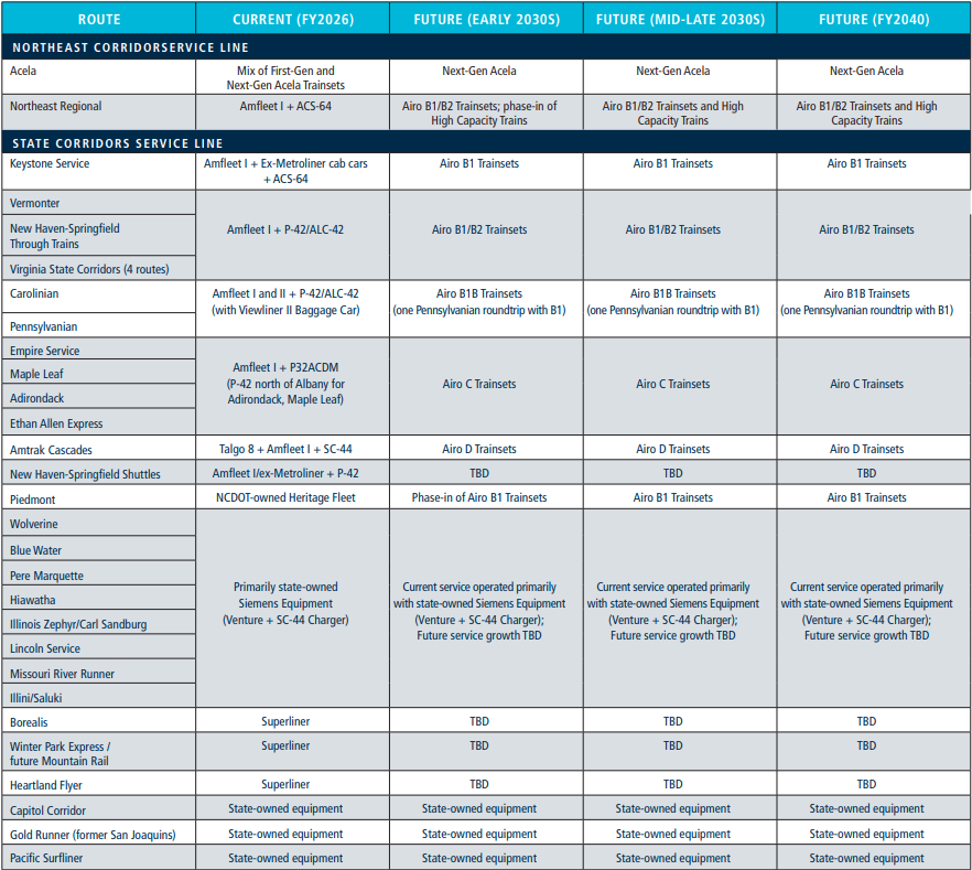
With the news on August 14th that more Airo trainsets will be procured for the Midwest routes, nearly the entire Amtrak network will shift from a capacity deficit to a capacity surplus. Even in the few situations where the new trains are shorter in length than those they replace, they will have more seats available. Simply having more trainsets, implying some routes could see increased frequencies as well, should also boost ridership independently of seat count: travelers are more likely to take the train when the timetable gives them more options. Further proof that Amtrak is pivoting toward major growth comes with the recent announcement of a ‘System Expansion Committee’, which could help prioritize where to assign current and new equipment for maximum impact. And in the nearer term, as reported two weeks ago, Amtrak and Canadian National have finally found a way to better allocate equipment on CN-hosted routes that’s compatible with CN’s track circuit systems.
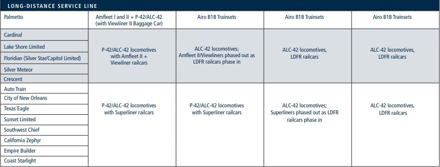
While this strategy for corridor services is a good sign, the elephant in the room remains Amtrak’s planned Long Distance Fleet Replacement (LDFR). The National Network of long-distance trains has elevated load factors, rapidly aging equipment, and sells out during peak travel times. But as with the corridor services, Amtrak’s fleet expansion plans are explicitly providing the capacity for future service expansions. We’ll take a closer look at what those plans could entail in the next installment from The Data Junction.
https://www.amtrak.com/content/dam/projects/dotcom/english/public/documents/corporate/businessplanning/Amtrak-Service-Asset-Line-Plans-FY26-31.pdf
A GREAT analysis, and very hopeful, although we will need to be patient, especially for new/added long distance cars.